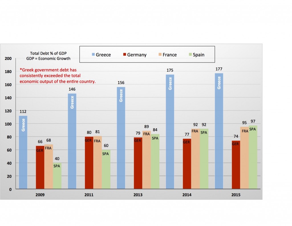
Comparison Charts: Greek Debt vs. Euro Zone Countries
Here’s a comparison chart from one of my articles about the Greek debt crisis. Instead of creating a simple chart showing Greek debt levels rising, why not create a chart drawing a comparison between Greece and the other major economies of Europe. By comparing multiple sets of data, the chart is far more informative and facilitates a more in-depth discussion about the crisis.


